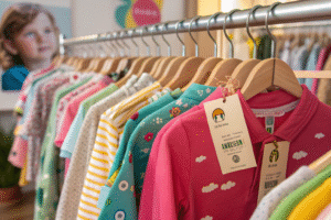
Cute designs catch the eye, but not every print holds up across seasons—or matches easily with other pieces.
The right prints and patterns in a kids’ capsule collection should be timeless, subtle, and easy to coordinate across multiple outfits and seasons.
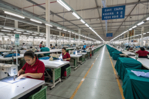
In my experience helping brands build scalable kidswear lines, prints often make or break the capsule logic. Let’s explore how to use them strategically.
Timeless Prints That Fit Every Season in Kidswear?
Some prints go out of style fast, leaving unsold stock behind. Others stay fresh year-round and appeal across ages.
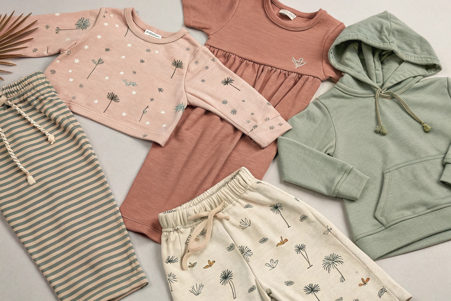
Timeless prints for kidswear include classic stripes, small-scale dots, soft plaids, and nature-inspired motifs that remain relevant season after season.
Which Print Styles Can Work Across Spring, Summer, Fall, and Winter?
From a production and retail point of view, the best all-season prints meet these criteria:
- Low contrast color use: Blends better across palettes.
- Small-scale patterning: Easier to match with solids.
- Nature-inspired themes: Like leaves, clouds, or animals.
- Classic structures: Such as gingham or thin stripes.
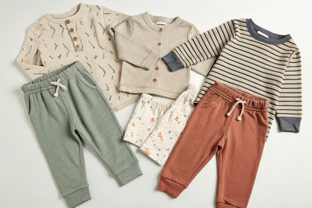
For example, a soft grey-and-white stripe tee can be layered under a fall hoodie, worn solo in spring, and matched with shorts in summer. One of our most successful collaborations used a subtle acorn print across tees and pajamas—neutral enough to fit all seasons, but playful for kids.
We help brands develop seasonal capsules using a single base print reimagined in different colors across the year. It’s efficient and keeps visual branding consistent.
How Can You Use Timeless Prints Without Getting Boring?
Capsules don’t need to be plain. Add variety by using:
- Different scale versions of the same print (large vs. micro polka dots).
- Print placement play: Full-coverage vs. chest-only motifs.
- Textured prints: Printed stripes on ribbed knits feel new.
- Two-tone versions: Use contrast without loud color blocking.
When working with prints, we offer clients preview simulations with outfit combinations. This ensures cohesion across the line while avoiding redundancy.
Capsules should feel curated, not repetitive—and timeless prints make that possible.
How to Mix Patterns in a Minimalist Capsule Wardrobe?
Pattern mixing can be risky in minimalist design. Too many bold choices, and you lose cohesion. Too few, and things look dull.
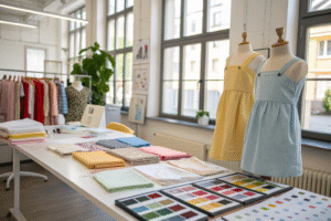
To mix patterns in a kids’ capsule, use a controlled color palette, vary print scale, and anchor outfits with neutral solids.

What’s the Safest Way to Mix Prints Without Losing Harmony?
We follow a simple structure when helping clients mix patterns in capsule sets:
- Pick a color palette – Max three core tones per collection.
- Choose one hero print – The boldest, most identifiable print.
- Support with micro patterns – Dots, mini checks, or muted graphics.
- Add solids for balance – Every print piece needs a partner.
For example, we built a capsule featuring a hero print of large forest animals. We paired that with moss green solids and micro-leaf prints in similar tones. This balance made the pieces interchangeable without clashing.
We often use print-mix mockups in lookbooks to show combinations that work. This boosts buyer confidence and helps parents see full outfits.
How Do You Avoid Print Overload in a Capsule?
Minimalism means purpose. Every printed piece must mix and match with at least three others.
To prevent overload:
- Limit to 3 prints per capsule – 1 hero, 2 support.
- Choose neutral-based prints – Earth tones, muted pastels, soft blues.
- Use print placement strategically – Sleeves only, pockets, or linings.
For younger kids, playful placement prints (like a pocket bunny) work well. For older age brackets, opt for scattered prints or abstract lines that feel more mature.
We help clients by offering “Mix Map” guides—charts showing which prints go with which solids. These are a hit in retail packaging and online shopping.
Best Neutral Prints for Long-Lasting Kids Capsules?
Bright unicorns or neon dinosaurs may sell quickly—but usually only once. Neutral prints, on the other hand, offer repeat value.
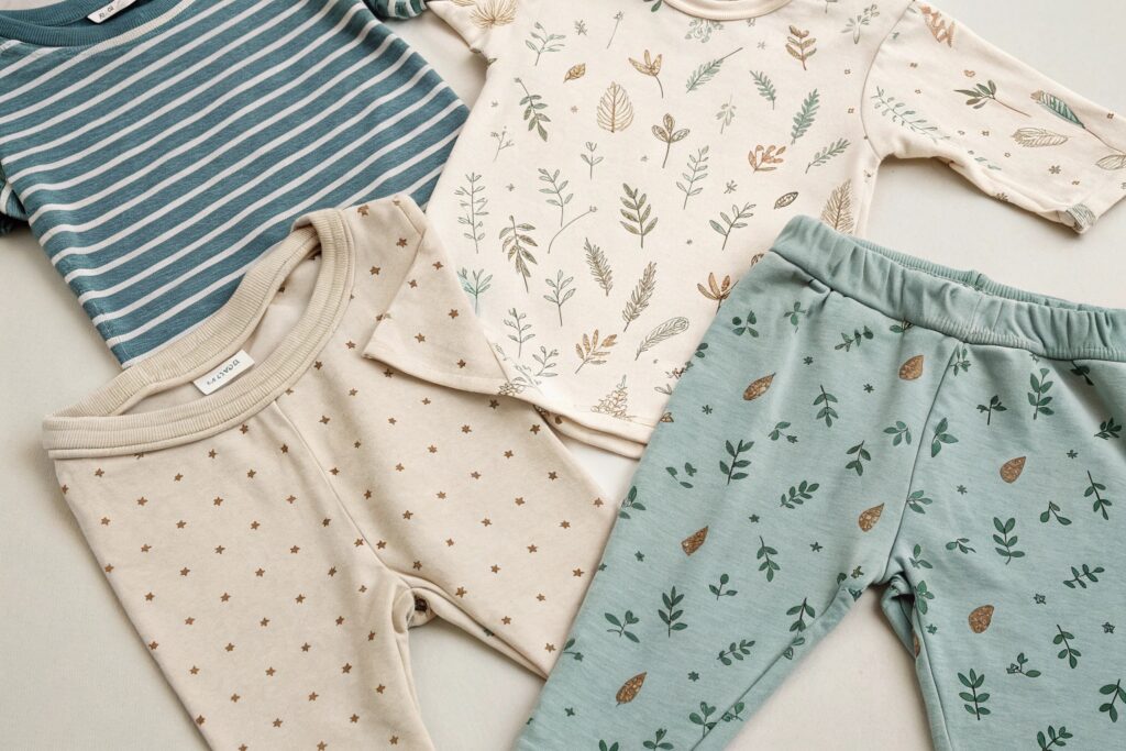
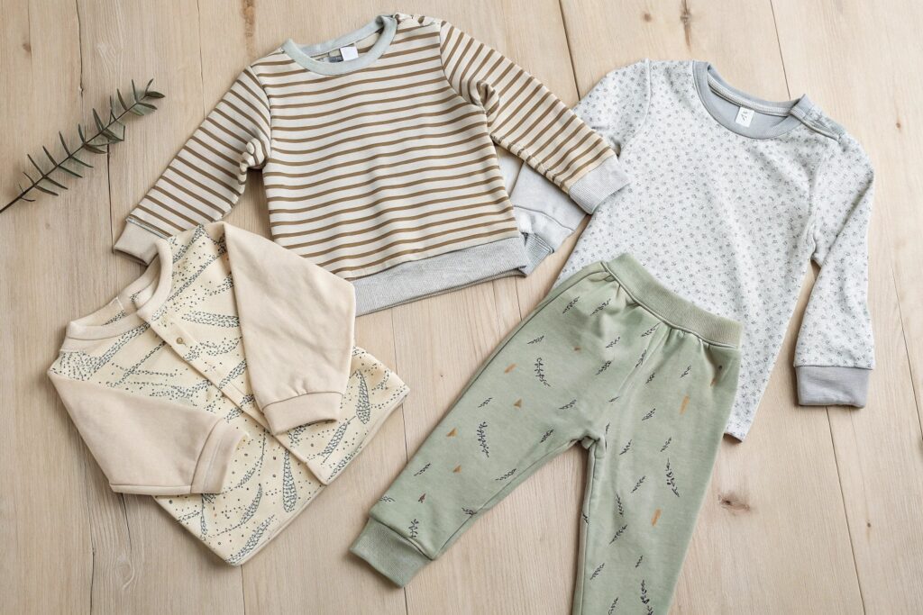
Neutral prints—like micro-stripes, dotted patterns, abstract lines, or botanical sketches—create calm, coordinated looks that survive seasonal shifts.
What Makes a Print “Neutral” in Kidswear?
Neutral doesn’t mean boring. It means versatile.
Here are key features of neutral prints:
- Low saturation colors: Beige, ivory, olive, slate, taupe.
- Simple geometry: Stripes, grids, dashed lines.
- Organic elements: Clouds, trees, water ripples.
- Gender-flexible icons: Stars, rainbows (in toned-down hues), moons.
We worked with a Scandinavian brand that used a greyscale bird print across tees, pajamas, and onesies. The same print, recolored seasonally, became their signature look.
These designs also help buyers simplify their supply chain. Neutrals reduce inventory risk and increase the reusability of leftover stock.
How Can Brands Use Neutrals to Boost Perceived Value?
When styled well, neutrals communicate calm, quality, and timelessness. To elevate them:
- Use textured fabrics – Ribbed knits or heathered yarns.
- Play with pattern density – Sparse patterns feel more minimal.
- Combine with natural trims – Wooden buttons, rope ties, or raw-edge hems.
In our experience, neutral-printed capsules can command higher price points—especially in boutique or organic-lifestyle markets. And when done right, they appeal to both fashion-conscious and function-first parents.
Neutral doesn’t have to mean safe—it can mean smart.
Choosing Gender-Neutral Designs for Versatile Capsules?
Many retailers now prioritize gender neutrality—but it’s not just about ditching pink and blue.
True gender-neutral capsule pieces use universal themes, unisex cuts, and color-agnostic prints that work across all age groups and identities.
What Are the Key Elements of Gender-Neutral Design in Kids Capsules?
In our factory collaborations, we design with these core principles:
- Unisex silhouettes: Drop shoulders, relaxed joggers, basic tees.
- Nature or abstract prints: Stars, leaves, brush strokes.
- Muted palette tones: Sand, sage, rust, navy, cream.
- No gender-specific language on tags or marketing.
For example, instead of “princess dreams,” a capsule piece might say “dream big.” Instead of truck graphics, we use movement-based themes like clouds, roads, or shapes.
One of our U.S. clients launched a “Grow Free” line with genderless designs and flexible fits. Their capsule sold out in three weeks—and returns dropped significantly.
How Can Gender-Neutral Prints Increase Market Reach?
They allow for:
- Simplified shopping – One line works for everyone.
- Higher resale value – Easy to pass down or donate.
- Cross-gender hand-me-downs – Boosts sustainability appeal.
- Broader marketing campaigns – No need to split imagery by gender.
We help clients design “core capsules” with gender-neutral styling and offer optional color-pop overlays (like lilac or forest green) for retailers who want more segmentation.
Gender-neutral is not just ethical—it’s economical. It lets you focus on fabric, fit, and function without boxing the product in.
Conclusion
Capsule collections thrive on cohesion, longevity, and smart design. With the right prints—timeless, neutral, coordinated, and inclusive—you can build lines that look great, wear well, and sell season after season. At Fumao Clothing, we bring your capsule vision to life from sketch to shipment.