Do you struggle with mismatched outfits and unused clothing in your child’s closet?
The secret to a functional kids’ capsule wardrobe lies in a coordinated, thoughtful color scheme that makes mixing and matching effortless.
Let me walk you through how to pick the right color palettes, avoid costly mismatches, and create kidswear collections that feel cohesive and timeless—whether you’re a parent or a clothing brand buyer.
Best Color Palettes for Children’s Capsule Clothing?
Which color combinations make kids’ outfits easy to style?
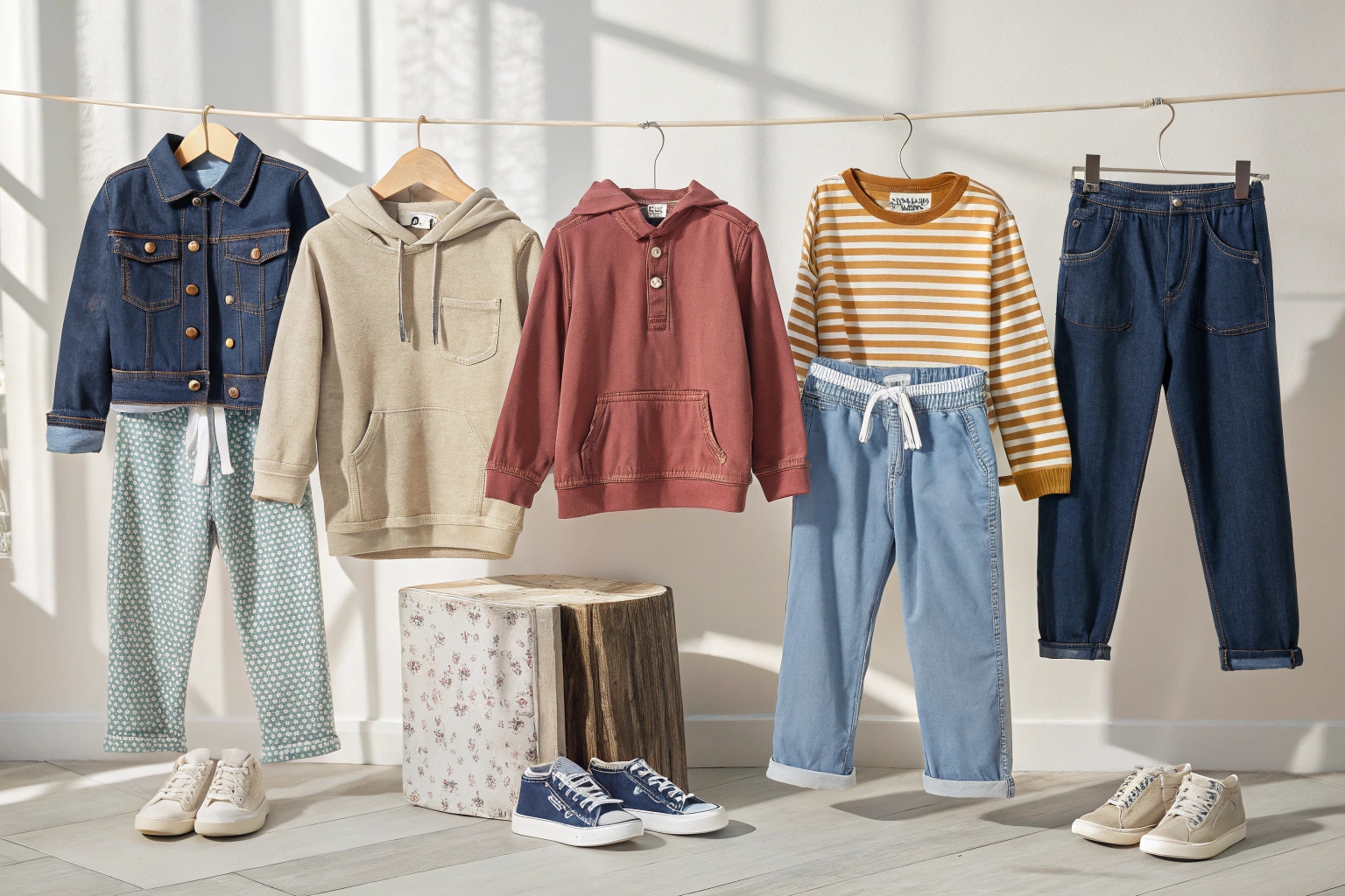
The best palettes combine soft neutrals, gentle hues, and just a few accent shades that coordinate well, ensuring every item pairs seamlessly with the rest.
What are the most practical and visually appealing base colors for kids?
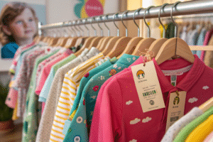
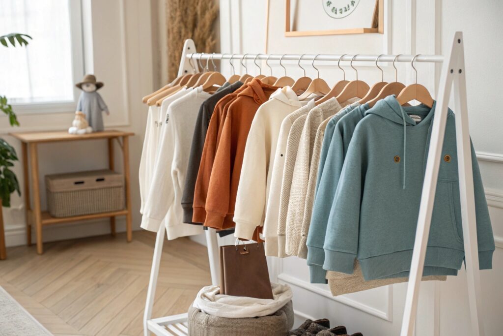
Neutral tones are the foundation of capsule wardrobes. They don’t just simplify styling—they extend garment use across seasons and reduce visual clutter. These are the go-to shades I recommend:
- White and off-white
- Gray tones (heather gray, light charcoal)
- Soft beige or camel
- Navy blue or dusty indigo
These colors work well for both tops and bottoms. They also allow brighter accents to pop without overwhelming the outfit.
From my experience working with global buyers through Fumao Clothing, sticking to a neutral-heavy core reduces manufacturing complexity and improves inventory turnover. It’s a win-win for brands and parents alike.
How can I add personality to a neutral capsule without losing harmony?
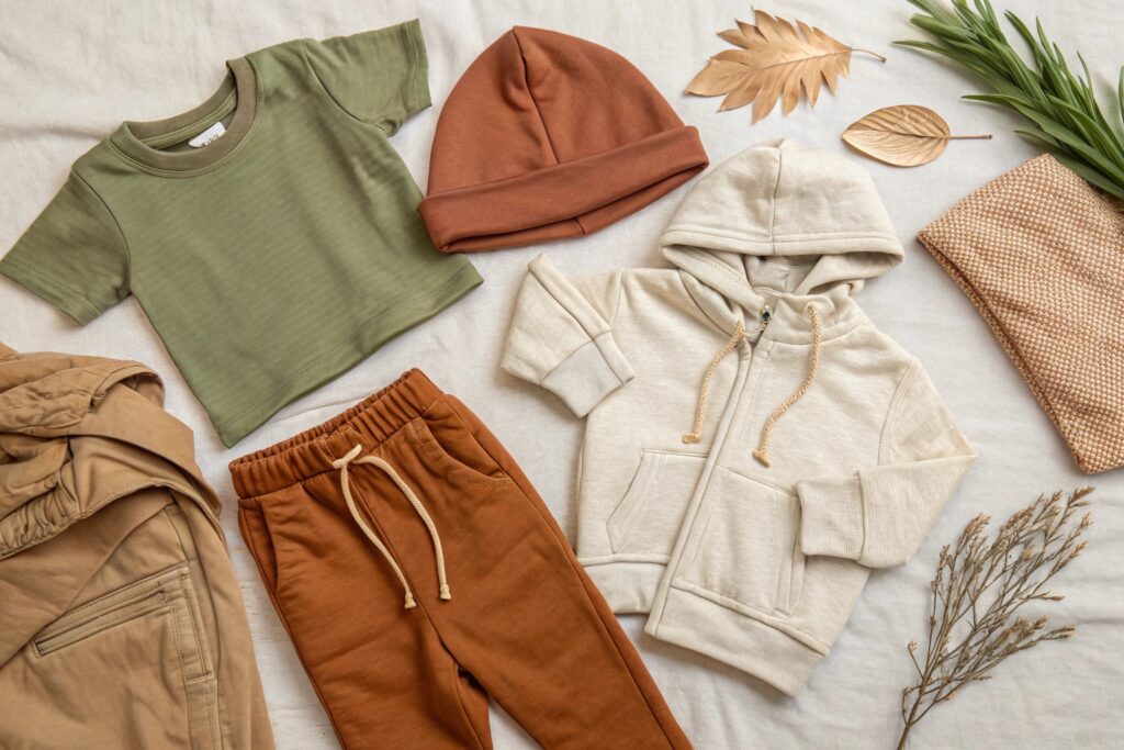
Accent shades provide the playfulness kids love. Limit them to 2–3 hues that work with all your neutrals. Popular options include:
- Mustard yellow
- Sage green
- Terracotta or rust
- Dusty rose or soft peach
Accent colors are great for graphic tees, trims, or accessories. But avoid overpowering prints or neon tones in small capsules—they’re harder to match and date quickly.
Use this rule: every accent piece should match at least 3 other items in the wardrobe. If it doesn’t, it doesn’t belong in a capsule.
How to Build a Coordinated Color Scheme for Kids?
How can you make sure every piece in a kids’ wardrobe works together?
Start with a small core palette of base colors, add a few accents, and apply the same scheme to every piece in the wardrobe for maximum cohesion.

What’s the step-by-step process for planning a kids’ capsule color scheme?
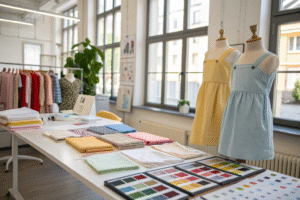
Follow this three-step method I use when helping brands develop capsule collections:
- Pick 2–3 base neutrals (e.g., white, light gray, navy)
- Choose 1–2 accent shades (e.g., sage, ochre)
- Stick to this palette across every category (tops, bottoms, layers)
Here’s how it might look in practice:
| Category | Color Example |
|---|---|
| Tops | Heather gray, ochre |
| Bottoms | Navy, beige |
| Layers | Gray, sage green |
| Outerwear | Navy or tan |
By repeating colors across categories, every piece becomes more versatile. And you don’t need a graphic designer to pull this off—simple color consistency makes everything look intentional.
What common mistakes should I avoid when creating a kids’ color scheme?
The biggest mistake? Too many disconnected colors. Parents get frustrated when items don’t coordinate. Brands see higher returns and abandoned carts.
Other mistakes to avoid:
- Over-relying on bright primary colors
- Adding prints that clash with other items
- Ignoring skin tone compatibility (earth tones work better across skin tones)
- Using different shades of the same color family without consistency
A limited palette doesn’t mean boring—it means clear. It also means easier upselling. At Fumao Clothing, we help our clients structure collections with consistent color logic, so buyers build full outfits—not just one-off items.
Tips for Choosing Gender-Neutral Colors for Kidswear?
Do you want to appeal to both boys and girls without defaulting to gray?
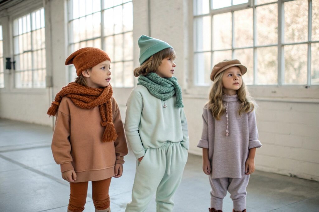
Gender-neutral colors go beyond gray and beige—they include earthy, natural tones and soft pastels that feel warm and modern without being labeled.
What colors feel inclusive without being bland?
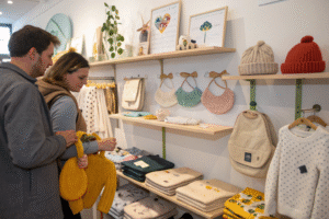
Neutral doesn’t have to mean colorless. Here are some great gender-neutral options:
- Sage green
- Dusty blue
- Burnt orange
- Sand or oatmeal
- Mauve or lavender-gray
These shades work well on all children and are especially popular among modern parents who want to avoid gender stereotypes. When I design sample lines for clients, we always start with a gender-free colorboard.
Even basic combos like “stone + terracotta” or “navy + mint” can offer warmth and balance without skewing too boyish or girlish.
How do gender-neutral colors impact sales and sourcing strategies?
Offering neutral palettes expands your market. Parents with multiple children love the ability to pass down clothing regardless of gender. For buyers like Ron who care about ROI, that means fewer SKUs, higher reusability, and a clearer product message.
From a production standpoint, sticking to a common palette allows fabric sourcing in bulk. At Fumao Clothing, we group fabric dye lots for clients across styles and sizes to reduce waste and improve consistency.
And from a branding angle, gender-neutral capsules align with current trends in ethical fashion and parenting philosophy.
Seasonal Color Trends in Kids’ Capsule Wardrobes?
How do you update capsule wardrobes with each season without overhauling everything?
Seasonal capsule colors introduce freshness through accents, while keeping the base consistent for easy mixing and brand continuity.
What colors work best for spring/summer vs. fall/winter capsules?
Here’s a breakdown of seasonal accent ideas:
| Season | Accent Colors |
|---|---|
| Spring | Soft peach, mint, sky blue |
| Summer | Lemon yellow, turquoise, coral |
| Fall | Rust, mustard, forest green |
| Winter | Deep plum, slate blue, burgundy |
Base neutrals remain the same (gray, beige, navy), while seasonal accents rotate. This allows you to update your line with just a few SKUs—great for retaining regular customers without overextending your inventory.
As a manufacturer, we encourage seasonal capsule updates through small-batch additions, rather than full relaunches. That keeps production efficient and allows brands to test what resonates with customers.
How can brands plan color changes without losing identity?
The key is subtle evolution. Maintain 70–80% of your color DNA across seasons. Introduce only 2–3 new shades in limited items. Repeat successful accents year-over-year if they sell well.
Color trend forecasting is something we help our clients with at Fumao Clothing. We track shifts in global kidswear palettes and advise which Pantone shades to incorporate. For example, last year’s clay red was huge across Europe; this year, soft jade is on the rise.
Keep color flexible, but always intentional. That’s how you grow brand consistency—one shade at a time.
Conclusion
Choosing the right colors for a kids’ capsule wardrobe is part art, part logic. Start with neutrals, add just enough personality, and always aim for harmony—because style should never come at the cost of practicality.